XAPCARD
Challenge:
A business networking app that reimagines the way we use business cards - how we create it, share it and manage contacts.
Project Name: XapCard for iOS and Android.
Role: UI/UX Designer
Year: 2018 – 2019
Website: www.xapcard.com
Challenge:
A business networking app that reimagines the way we use business cards - how we create it, share it and manage contacts.
Project Name: XapCard for iOS and Android.
Role: UI/UX Designer
Year: 2018 – 2019
Website: www.xapcard.com
Business cards haven’t fundamentally changed since their inception over 100 years ago. These days, social media and websites have disrupted the way we network and business cards have become somewhat redundant.
Most businesses and entrepreneurs still spend thousands of dollars a year producing business cards because it’s an essential part of business networking. Yet, studies show that over 90% of business cards end up in the trash within the first week. It became clear; business cards are still useful but they just haven’t changed with the times.
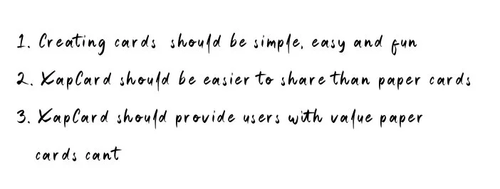
If business cards are to evolve, it is important they provide additional value that paper business cards simply can’t. For instance, one use case is sharing your business card with hundreds of people in an instant, with one simple click. This makes networking efficient at sales conferences, meetings and networking events.
Since digital cards are not confined to a two sided plane, we can redefine what a business card can be. It can be a portfolio, a pitch deck, or a mini site.
I worked with a team of technologists to make XapCard happen. Here is a case study of how we did it.
Our users primarily live in the city, they are young (24 – 44), they are entrepreneurs, freelancers, sales professionals, financial advisors, DJs and job seekers. They attend more than 3 networking events a month and they hand out many business cards and design portfolios. I sent out a Google Survey regarding their networking habits to see how they manage their business cards and we asked them to select from a list of multiple solutions.


Ideation session with the product owners
Competitor analysis, explore UX trends and designs
Interview potential users
Create user flows, and sketches
Define use cases
Test paper prototypes, gather feedback
Iterate, create low fidelity wireframes
Create Style Guide
Create high fidelity wireframes
Test interactions and animations
Drink lots of coffee, hydrate. Try not to breakdown and cry.
Iterate.


Many users expressed some annoyance regarding signing up for another app and memorizing passwords and so on. We thought it would be valuable to create a system that didn’t feel like a sign up.
NO PASSWORD LOGIN
We made sign up frictionless by removing passwords altogether. The user needed to enter their email address, then they receive a 4 digit code that logs them in. If they’re ever signed out, they just need to enter their email address and follow the steps. No password is ever required.
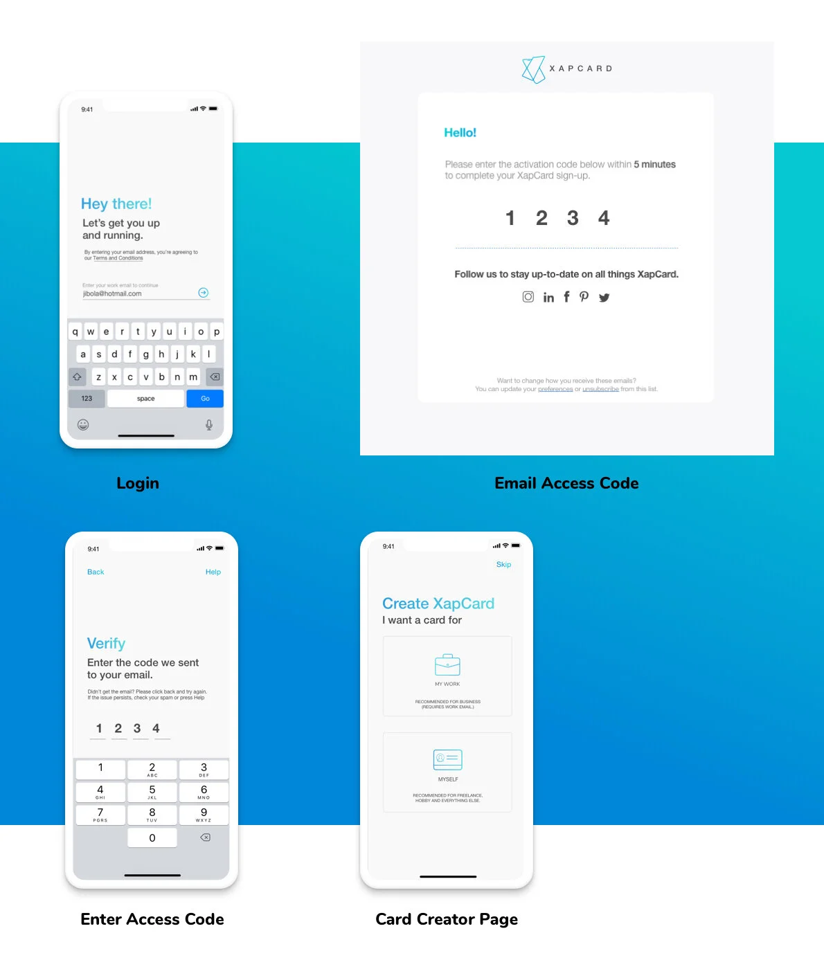
AUTO DESIGN
If the user enters their work email, the card creator fills all the other details i.e. work address, phone number etc and the user can verify and publish the card in seconds.


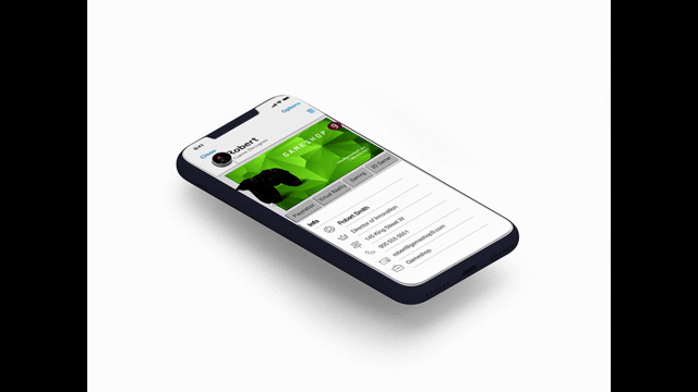
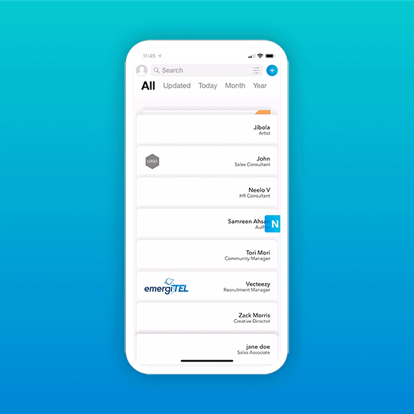
The Rolodex page stores all received cards. By default, the cards are sorted by Time, but the user can filters with Location, Job Title, Company. The cards on the Rolodex have two states; closed, open and expanded.
Closed: When cards are closed, what’s visible is Name, Job Title and Logo(if available).
Open: When the user taps on a closed card, it opens, and the user can see all the pages available and interact with the card
Expanded: When the user taps on a closed card, it opens, and the user can see all the pages available and interact with the card

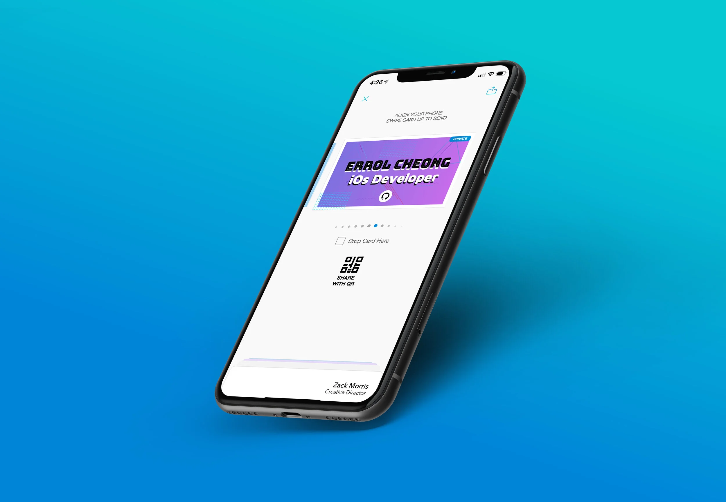
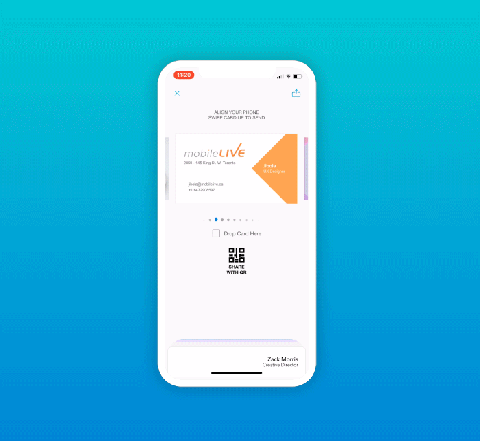
All the cards the user created is stored in the Send Page. We wanted to make sure it was easy to share, regardless of if the recipient had the app or not.
Swipe Up: The user can simply SWIPE up their card, and if the recipient has the app, they receive it on their side.
QR Code: If the recipient doesn’t have the app, they can scan the QR code with their phone camera, and it generates a web version of the card .
Drop: This lets the user drop their card virtually in a physical space. One possible use case is – if you’re a speaker at a conference and you wanted to share your card with a crowd of 100 people – drop the card, and the crowd can go to the receive mode of the app, and pick it up.
With a PULL DOWN gesture, the user can receive a card that has been sent to them or that was dropped at the location. During testing we found we didn’t want to limit the different ways people like to add new contacts.
Pull Down: By pulling down the screen, the user can receive multiple cards at a time
QR Code: QR opens up the camera in the app, then loads up and accepts the new card. This even works when the user has no internet connection.
LinkedIn: This let’s user add new contacts directly from LinkedIn. This creates a LinkedIn Card that makes it easy to find contacts in the future. It time stamps the date, time and location of when the card was received.
Shocking Statistic, most business cards ends up in the trash within the first week! All that money down the drain. Users wanted get insights on what happens to your card after you hand them out. XapCard tracks how people interact with your card, how many website hits you get, email clicks or phone calls from your card.

Most users found designing a card from scratch quite daunting. Also at events, most people wanted to skip the card creation process or create one as quickly as possible. The question was, how do you inspire users to create a card and make them feel rewarded after it was created.
Card creation should take less than a minute
If should give users of all skill levels an opportunity to explore different card design options

The brand guideline led us to pick cool tones that were slick, minimal and non distracting. The blue gradient was chosen to give the brand a futuristic feel that was bold but not overwhelming.
The grey white background created a neutral base that doesn’t clash with card-designs.
Text colour was three different values of grey – dark grey, mid tones, and light grey.

Typography is an important component of visual design and I wanted to select fonts that had the right visual polish, modern and familiar, and slick. I chose 2 fonts:

A big thank you to all the people who awho participated in tests and user interviews to improve the experience of XapCard. I also want to thank the XapCard team, Ghazanfar, Jagraj, Shannon, Farhad, Errol and Zahra.
That’s it!